Note that when the cursor is over either of these panels
(general or class-specific),
the current selection in the hierarchy list automatically changes to
the object represented by the panel.
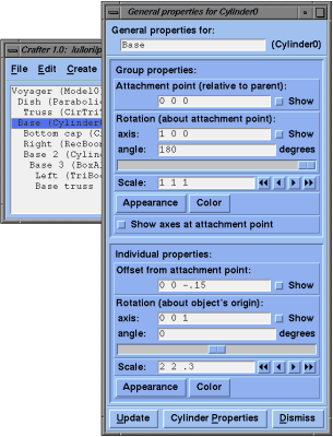
3.6.1. General properties
An object's general properties can be edited using the
General Properties Panel, which you can get by either double-clicking
on the object in the hierarchy list, or by selecting the object in the list
and then selecting the General Properties... item from the Edit
menu.
General properties include a name for object, appearance information, and
transformations which specify the way and object is attached to its parent.
at its parent's origin, with no rotation or scaling.
By default, an object is attached to its parent with its own origin
at its parent's origin, with no rotation or scaling.
3.6.1.1. Long name
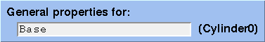
Every piece of the model is assigned a unique name or address. This address may change each time you load the file, though. To make your pieces easier to identify, you may supply a long name to each piece. It can be any string you want. It may contain spaces and does not need to be unique. The long name can be edited at the top of the General Properties Panel.
Appearance properties include attributes such as color, line width and shading. The relationship between group appearance and individual appearance is fairly straight forward. When an individual appearance property is given, it overrides any group definitions of that property for that object. If an appearance property is not defined at the individual level, then the group definition nearest up in the hierarchy is used. Overriding appearance properties is determined on a per-property basis. For example, changing the line width of an individual object will not reset all other properties at the individual level.
The difference between group transformations and individual transformations is a bit more complicated. Properties defined at the individual level do not cancel-out properties defined higher in the hierarchy. They are applied in addition to transformations at all other levels. When a transformation property is applied to a group, the whole group is treated as one piece; scaling, rotating and translating act on the group as a whole. Individual transformation properties are applied to the object as well as to the attachment points of the rest of the group. In other words, changing the scale or rotation of an individual object does not change the scale or rotation of the rest of the group, but may change the positions of the objects in the group.
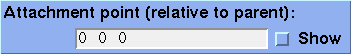
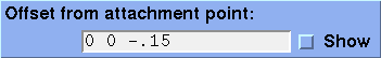
There are two fields that affect translation. The attachment point relative to the parent, and the offset from this attachment point.
The attachment point is in the coordinate system of the parent. The offset point is in the coordinate system of the child. By default, both of these are "0 0 0".
To display either of these vectors in the model, click in the checkbox marked Show to the right of the text field.
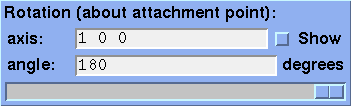
There are two parts to specifying a rotation, the axis of rotation and the angle of rotation. The angle of rotation is specified in degrees and may be typed into the angle text field by hand or may be changed using the slider below it. Using the slider immediately updates the Geomview display. The axis is commonly either the X, Y or Z axis, but may be any arbitrary vector. The vector must be typed in by hand to the axis text field.
To display either of the rotation vectors in the model, click in the checkbox marked Show to the right of the text field.

Scales are specified by vectors as well. The x, y and z portions of the vector give the scale factors for the X, Y and Z dimensions, respectively. For uniform scaling, all three numbers should be the same.
A short cut for changing the scale uniformly is provided with step buttons to the right of the text field. Clicking on these buttons causes the scale to increment or decrement proportionally, by either a little step or a big step. The four buttons from left to right are: decrement big step, decrement little step, increment little step, and increment big step.

Because Geomview allows you to change the orientation of the model in the camera window, sometimes its difficult to remember which direction is which in the display. To aid with this, you can display coordinate axes of unit length at the attachment point in the display. The axes show the coordinate system of the group. To display the coordinate axes, click the Show axes at attachment point checkbox.
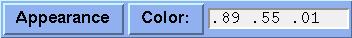
Crafter allows you to modify the appearance of objects in the model. Appearance properties include: shading, showing faces, showing edges, line width, texture mapping, face color and edge color. Other Geomview appearance attributes such as material properties may be set as well. To change the face color or edge color, click on the Color button or edit the face color directly in the text field to the right of the color button. To change any other appearance property, click on the Appearance button. Make sure you choose which type of properties you want to change and click on the appropriate button in either the Group properties section or the Individual properties section. Separate windows are used for color and appearance properties.
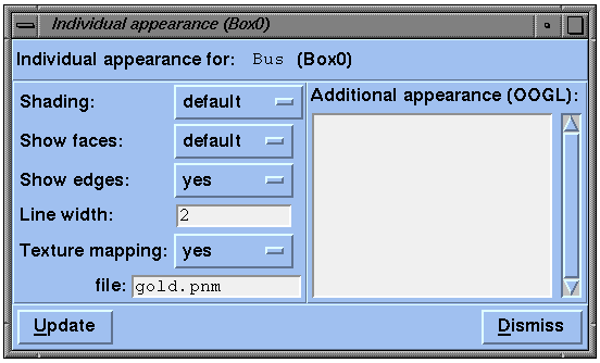
In the appearance editor shading and showing faces and edges are controlled by toggle menus. Line width is controlled by a text field. Texture mapping is controlled by two properties. First a toggle menu for whether or not to apply texture mapping, and second a text field for the name of the image file to use. The image format type must be indicated by the last few characters of the file name. Supported image types are .ppm (or .ppm.Z or .ppm.gz), .pgm (or .pgm.Z or .pgm.gz), .tiff, .gif and .sgi. For this feature to work, some programs must be available in geomview's search path:
  *material {
    *shininess 100
    *ks 0.8
  }
See the Geomview manual for more information about specifying appearances.
When you are done editing the appearance, you must click the Update button to see the changes in Geomview. (Since carriage returns are allowed in the text area, they do not cause the display to be updated as they do in single line text fields.)
|
Warning: The syntax of the appearance is not checked before sending it to Geomview. If there is an error, Geomview will send information about it to standard error (stderr) and the pipe between Crafter Geomview will be broken. You may save your work in Crafter, but need to restart Crafter to send updates to Geomview again. |
By default, the toggle menus are set to default (no surprise) and the line width field is empty. This means that nothing is said about these properties for this object. In this case the object will inherit the properties though the hierarchy. If a property such as shading is defined both in the toggle menu on the left and the Additional appearance text window on the right, then the definition in the text window overrides the setting of the toggle window.
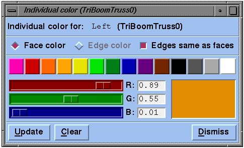
Since color is such a common appearance property to change, it is given its own window. You can also edit it directly in the General Properties panel. The simplest way to choose a color is to select one of the existing colors in the palette -- click on one of the colorful buttons across the middle of the window. The color change takes effect immediately in the Geomview window. If none of these colors is what you want, pick one that is close and then edit it with the red, green and blue sliders at the middle-left. These control the red, green and blue components of the color. Alternatively you can type in these three values directly in the text fields immediately to the right of the respective sliders. A sample of the color you are making is shown in the rectangular trough at the right.
By default, faces and edges are colored the same. If you want them colored separately, click in the checkbox labeled Edges same as faces to deselect this option. Now you may use the radio buttons at the top of the window to alternate between Face color and Edge color.
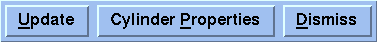
There are three buttons at the bottom of the General Properties Panel:
3.6.2. Class-specific properties
Each type of object has its own properties.
For example, a box has length, width, and depth, and a parabolic dish has
diameter and ratio (of focal-length to diameter).
These properties are called class-specific properties.
To edit these properties, select the object in the hierarchy list in the
Model Editor, and then select Class-specific Properties...
from the Edit menu, or
if the object's General Properties Panel is already up, then you may
click on the Class-specific Properties button at the bottom of that
panel.
Here is an example of a Box's Class-specific Properties Panel (or Box Properties Panel):
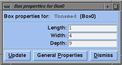
At the top of the panel is the name and class of the object. Depending on the class, the panel may have text entry fields, checkboxes, and other fields. Pressing <ENTER> in any text field updates all class-specific properties. Clicking in a checkbox, or moving a slider, also updates all class-specific properties for the object.
You can change the overall scale, rotation and translation of everything
in the model by changing the group properties of the model.
You can transform just the attachment points of the top level objects
by changing the individual properties of the model.
Changing the model's group appearance is like setting a default appearance
for all objects. Setting the model's individual appearance has no effect.
The options controlled in this window are:
Note that the background color is the only option saved with the
file.
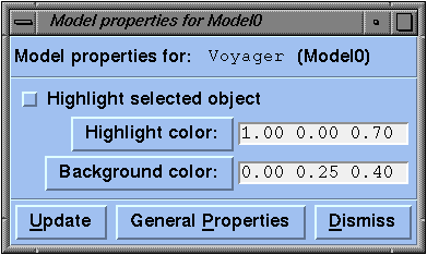
3.6.3. Model properties
Not just primitives have properties associated with them,
the model does, too. In fact, a model is just like a primitive, but
doesn't have its own geometry associated with it and it's always at
the top level of the hierarchy.
3.6.4. Options window
The Options Window allows you to specify options that apply to the whole
model. These options are just the class-specific properties of a model
(i.e. model properties).
To invoke this window, select Options... from the Edit
menu. If the model's General Properties Panel is already up, then you may
click on the Model Properties button at the bottom of that panel
to get the Options Window.
3.6.5. The Null primitive
The null primitive is a primitive that has no geometry of its own.
It is useful for creating groups of objects that don't have a master
object that they are attached to. Editing its properties are like
editing the model's properties. Group transformations act on the
whole group. Individual transformations act only on the attachment
points. Group appearance effects the whole group. And individual
appearance means nothing since the object has no geometry of its own.
3.7. Editing the hierarchical structure
Groups of objects may be cut and pasted using the items
in the Edit menu.
First select an object or multiple objects in the hierarchy list in the
Model Editor. Then invoke the appropriate operation from the Edit menu.
Multiple objects may be selected for cutting, copying, duplicating or deleting,
but only one object may be selected for pasting into.
When cutting, copying, duplicating and deleting, the selected object and
all objects below it in the hierarchy are also affected.
For example, deleting an object
also deletes everything that is attached to it hierarchically.
A summary of the edit operations follows.